

Match.com, a pioneer in the online dating scene, was launched on April 21, 1995, marking a significant change in how people seek relationships. Its creation stemmed from a vision to simplify and revolutionize the process of finding compatible partners. Available both as a website and an app, Match.com caters to users seeking diverse relationship types, embodying a mission to "empower users to forge their own path to romance." Founded by Gary Kremen and initially owned by IAC, Match.com now operates under Match Group. Its global reach spans numerous countries, making it a truly international platform.
finding serious long-lasting relationships.
- Match.com's advanced algorithms, which adapt to user preferences and refine matches over time, offer a personalized dating experience.
- With over 20 million users globally, Match.com provides a vast pool of potential matches.
- The platform's intuitive design and easy navigation, both on the website and mobile app, enhance the user experience.
- Match.com offers a variety of communication options, including email notifications, VIP emails, dynamic chat interfaces, and Vibe Check, a free video chat feature.
- The platform's commitment to user safety, evidenced by partnerships with organizations like RAINN and robust privacy policies, provides a secure environment for online dating.
- The restriction of messaging to just one person per day in the free version can be a significant limitation for active users.
- While the mobile app generally mirrors the positive experience of the website, occasional performance issues like lagging can detract from the overall user experience.

Step into the detailed world of Match.com, a titan in online dating with a user base exceeding 20 million. This review delves into its cutting-edge matchmaking algorithms, tailored for a demographic seeking serious connections. We’ll dissect its feature-rich platform, pricing strategy, and why it stands out in the crowded digital dating sphere.
The User Experience on Match.com
My satisfaction level stands at a solid 8 out of 10, with the platform’s meticulous attention to user experience, smart matchmaking, and intuitive design being the highlights of my journey.
Sign-up Process and Creating a User Profile on Match.com
Signing up on Match.com felt like embarking on a promising new chapter. The process was straightforward yet detailed enough to feel personal. It began with basic details – age, gender, preferences – and gradually moved to more in-depth questions. What impressed me was the level of personalization; from hobbies to life goals, I could express my individuality. The privacy settings were a relief, ensuring my information stayed as private as I desired.
Matchmaking Algorithms and Search Functions
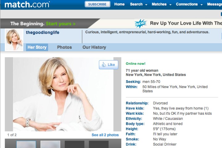
Match.com’s matchmaking algorithms are its crown jewel. During my time there, I noticed how these algorithms adapted to my preferences, refining matches over time. It wasn’t just about age or location; it delved into hobbies, values, and more. The search functions were a high point – robust and user-friendly. Filters allowed me to narrow down potential matches by interests, lifestyle, even zodiac signs, making the daunting pool of candidates feel tailor-made for me.
Match.com’s Design, User Interface and Usability
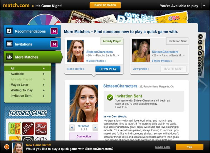
The first thing that struck me about Match.com’s design was its welcoming simplicity. The color scheme was easy on the eyes, and the layout was intuitive. Navigating through profiles, settings, and messages felt fluid, with each feature thoughtfully placed. The mobile app mirrored this experience, maintaining the website’s intuitive navigation and clean design. While the app occasionally lagged, it wasn’t a dealbreaker. The overall design and usability were impressive, contributing significantly to my positive experience on the platform.
Communication and Interaction Tools on Match.com
Match.com excels in communication tools, offering email notifications and unique VIP emails that highlight messages in recipients’ inboxes. The chat interface is dynamic, with emoticons and photo sharing, enhancing real-time interactions. A key feature is Vibe Check, a free video chat available on the app and desktop, allowing deeper connections before meeting in person. It’s accessible on iOS and Android with no time limits. However, the free version limits messaging to one person per day, making a subscription valuable for active users seeking deeper engagement.
Match.com’s Cost and Pricing
The free version of Match.com allows users to explore the platform and view profiles. However, it limits messaging to just one person per day. Users without a premium plan can engage in basic activities but miss out on more advanced communication options like phone calls or video chats. They can still use features like winks, pokes, smiles, and send gifs, videos, and links to enrich their interactions
Match.com offers two main types of subscriptions: Standard and Premium. The Standard Plan’s monthly costs are $45.99 for 1 month, $31.99 for 3 months ($95.97 total), $22.99 for 6 months ($137.94 total), and $18.99 for 12 months ($227.88 total). The Premium Plan, on the other hand, costs $50.71 for 1 month, $34.99 for 3 months ($104.97 total), $24.99 for 6 months ($149.94 total), and $19.99 for 12 months ($239.88 total).
Comparing Match.com’s pricing with other popular online dating websites, it’s evident that Match.com’s pricing is structured to provide more comprehensive features and services in its Premium Plan, which may be more costly than some competitors. However, the Standard Plan offers a more budget-friendly option while still granting access to most of the platform’s essential features.
Demographics and User Base
In my time on Match.com, I noticed a strikingly diverse age range. Predominantly, users seemed to be in their 30s and 40s, indicating a crowd more interested in serious, long-lasting relationships. This was a refreshing change from platforms dominated by much younger users often focused on casual encounters.
The geographic spread of Match.com users is vast. I interacted with people from all over North America and Europe, and even had conversations with users from parts of Asia and Latin America. This global reach made the experience more enriching, opening doors to different cultures and perspectives.
As for the diversity within the user base, Match.com did not disappoint. I encountered professionals, artists, and people from various socio-economic backgrounds, each bringing their unique stories and experiences to the table. This blend of cultures, ethnicities, and lifestyles made my experience on the platform more vibrant and engaging than I initially expected.
What Users Say about Match: User Reviews, Ratings, Testimonials
Match has cultivated a unique presence in the online dating world, reflected in its user feedback across various platforms. The overall sentiment on review sites like Trustpilot and Sitejabber reveals diverse experiences, with users highlighting both favorable and less favorable aspects of the service.
How Users Rate Match on Trustpilot and Sitejabber?
On the reputable review platform Trustpilot, Match has received a rating of 3.3 out of 5 from 28 reviews. This score indicates a mix of experiences, with some users expressing satisfaction with Match’s user-friendly interface and the diversity of profiles available. However, this rating also suggests room for improvement in aspects like customer support and the matching algorithm.
Similarly, on the comprehensive review platform Sitejabber, Match boasts a higher rating of 4.28 stars out of 5 from 17,545 reviews. This impressive rating reflects a predominantly positive experience among a significant number of users. Appreciated features include the effective matchmaking system, the quality of profiles, and the safe and respectful dating environment Match fosters. However, some users have noted concerns about subscription policies and the occasional presence of inactive profiles.
What are Users Saying about Match on Forums Such as Reddit and Quora?
Discussion forums like Reddit and Quora provide a more personal and diverse perspective on Match. Users on these platforms often share detailed experiences, offering a broad spectrum of views on the dating service.
Positive feedback on these forums frequently highlights Match‘s success in facilitating long-term relationships and its robust user base, making it a preferred choice for those seeking serious commitments. Users often commend the platform for its comprehensive profile structure, which allows for a deeper understanding of potential matches.
On the flip side, some common criticisms include the cost of subscription, with users feeling that the free version is limited in functionality. Additionally, there’s a mention of occasional encounters with inactive or fake profiles.
Negative User Experience: Another user on Reddit shared a distressing experience where their date from Match.com behaved inappropriately and aggressively. This encounter, which included a physical assault at a social gathering and subsequent harassment, led the user to be disillusioned with online dating.
Match.com’s Privacy and Safety Features
Match.com’s commitment to privacy, safety, and customer support is evident through various features and policies:
Privacy Policies and User Safety
Match.com prioritizes user safety with several measures:
- Partnership with RAINN: They have collaborated with the Rape, Abuse & Incest National Network (RAINN) to enhance reporting, safety, and messaging features, providing access to support resources through their Safety Center.
- Reporting Mechanism: Users can report inappropriate activities or users, which are reviewed by Match.com’s team to take necessary actions.
- Conversation Safety: The platform advises keeping conversations within the app for safety and flags moving platforms without meeting or video calling as a red flag.
- Financial Safety: They strongly advise against exchanging money with someone met online, including wire transfers, currency exchanges, gift cards, and investments.
- Scam Awareness: Match.com warns against false promises and emergencies created by scammers, emphasizing skepticism and alertness to urgency around money.
- Judgment and Vigilance: Encourages users to trust their instincts and remain vigilant, as scammers’ methods vary and often don’t mention finances until trust is gained.
Refund Policy
Match.com’s subscription plans are non-refundable. The cancellation of subscriptions can be managed via their “Manage Subscription” page, with further details available in section 8d of their Terms of Use.
Customer Support
The customer support at Match.com is described as friendly and helpful, with room for improvement and expansion. Users can contact support through:
- Live Chat: Available Monday to Friday from 8 am to 5 pm, providing quick access to the support center.
- FAQs Section: A comprehensive section that covers a wide range of commonly asked questions, allowing users to troubleshoot problems and inquiries effectively.
Best Dating Sites Like Match.com To Use Instead
To conduct a comprehensive comparison of Match.com with other popular online dating websites SofiaDate and Tinder, we’ll evaluate key components such as features, user experience, and success rates. These comparison will be helpful for those looking for Match.com alternatives.
| Aspect | Match.com | SofiaDate | Tinder |
|---|---|---|---|
| Features | Standard communication tools, video chat, good profile customization | Advanced communication options, unique features | Basic communication tools, limited profile customization |
| User Experience | Good usability, intuitive app, decent design | Excellent ease of navigation, superior mobile experience | Poor navigation, outdated design |
| Success Rates | Average success stories and user testimonials | High success rate with numerous positive stories | Low success rate, few success stories |
| Safety Features | Strong safety tools, partnership with RAINN | Exceptional safety measures, user verification | Basic safety features, lacks comprehensive protection |
| Profile Quality | Detailed profiles, various options | High-quality profiles with in-depth information | Superficial profiles, lacking depth |
| Search Filters | Effective but standard filters | Extensive and customizable filters | Basic, less efficient filters |
| Customer Support | Responsive but limited hours | 24/7 support with quick response | Slow response, limited support options |
In conclusion, while Match.com offers a reliable user experience with good safety features and decent success rates, it falls short compared to SofiaDate’s advanced features, superior user experience, and higher success rates. Tinder, meanwhile, lags in most aspects, particularly in user experience and success rates.
Final Thoughts in our Honest Match.com Review
In summary, Match.com emerges as a formidable leader in online dating, marrying sophisticated technology with user-centric design. Its appeal lies in effectively facilitating long-term relationships, a testament to its pricing and features.
